Claude Closky

It is tempting to see the work of artists who use images of advertising and mass media as little more than a re-hashing of Pop Art. After all, the raw material is almost always the same, and the artists still tend to shift ambiguously between celebration and critique. However, compared to Claes Oldenburg's work, or Richard Hamilton's collages of the 60s, which find their present day reincarnation in Thomas Hirschorn's approach of 'quantity, not quality', Claude Closky is on another wavelength altogether. There's something very 90s about his collages, videos and slide shows, a slick, polished aesthetic in pastel colours and ambient sounds that recall Mies Van der Rohe's 'Less is more'.
Although Van der Rohe's credo is not so applicable to Closky's earlier work, it does apply to this somewhat disappointing exhibition of a modest selection of mainly recent works. Appelez-vite (Call Quickly, 1995), which provides a sound link between the pieces in the show, is a recording of telephone numbers called out daily on the radio. A video based on the same repetitive structure projects an infinite succession of commercial slogans beginning with Envie de (Do you feel like, 1999) typed out in white letters over brightly coloured background. As in Appelez-vite, the deadpan humour of Envie de is based on an accumulation of phoney enthusiasm. It works quite well, effectively conveying the infantile nature of commercial language, and its attempt to turn us into brainless consuming machines .
But such a message doesn't seem to be Closky's intention, and unlike, for example, Hans Haacke or Barbara Kruger, he resists being overtly political. Guili Guili (1999) - 140 small collages in which an onomatopoeia inscribed inside a speech bubble gives life to figures cut out from glossy fashion magazines - embodies his humorous and politically uncommitted approach. Despite the heavily coded imagery, Closky's work exudes a carefree distance, suggesting perhaps that beyond a clever perspective or a formal construction, there's no such thing as meaning in a work of art.
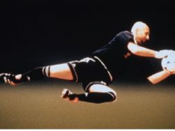
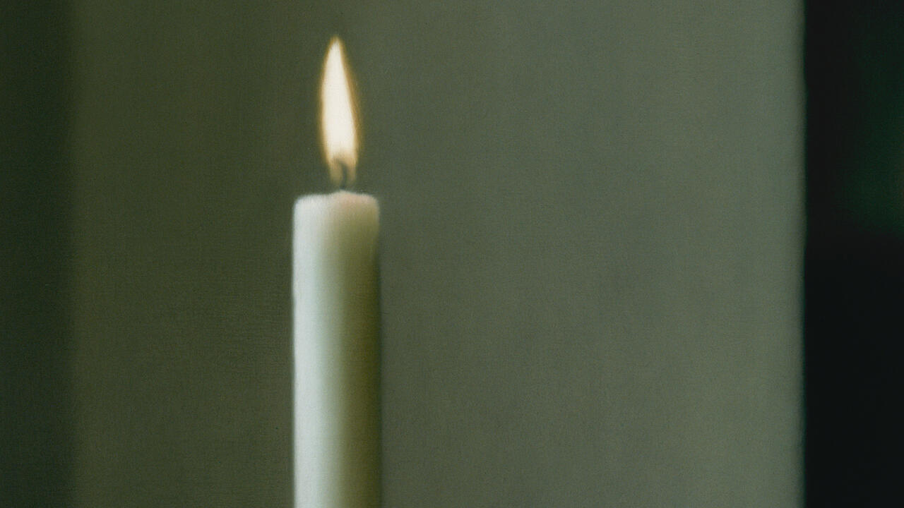
Most of Closky's works explore repetition, accumulation, and alphabetical, numerical or binary classifications. Some of Closky's recent works replace obsessive classification with double images, explicitly referencing painting through their titles and monumental scale. Sans Titre (Barthez), (Untitled, Barthez, 1999), a two slide installation, is the most impressive: a billboard-sized projection showing the star goal from the French World Cup team, represented jumping to one side and then reversed on the other. Once again, it is tempting to read this reversed image as an allegory of the deceptive power of images; yet if there is something reminiscent of James Rosenquist in the format, it is certainly less cynical than F-111 (1964-65) ever was.
Closky's use of monumental scale in the recent works has replaced his habitual wit and irony, with a hollow mannerism. There's an impression that he has begun to take himself seriously - the discreet seduction of his earlier, less image-based works has given way to a more explicit seductiveness, which seem to mimic advertising more than they comment on them. This perhaps is not surprising; Closky was one of the first artists invited to participate to the Musée de la Publicité's recent re-opening, designing a press package and other press-oriented devices. In addition, the new museum developed a scheme in which young artists who use advertising as raw material are invited to skim through the museum's collection to find suitable imagery for their creations.
In terms of advertising ripping off contemporary art, this project definitely seems to set new boundaries, and while giving an insight into Closky's outsider-insider position, it also (rather cynically) brings to a conclusion the carefree apolitical aesthetics of the last decade.


