


Critic’s Guide: Tokyo
Our picks of the best recent and current shows in the Japanese capital
Our picks of the best recent and current shows in the Japanese capital


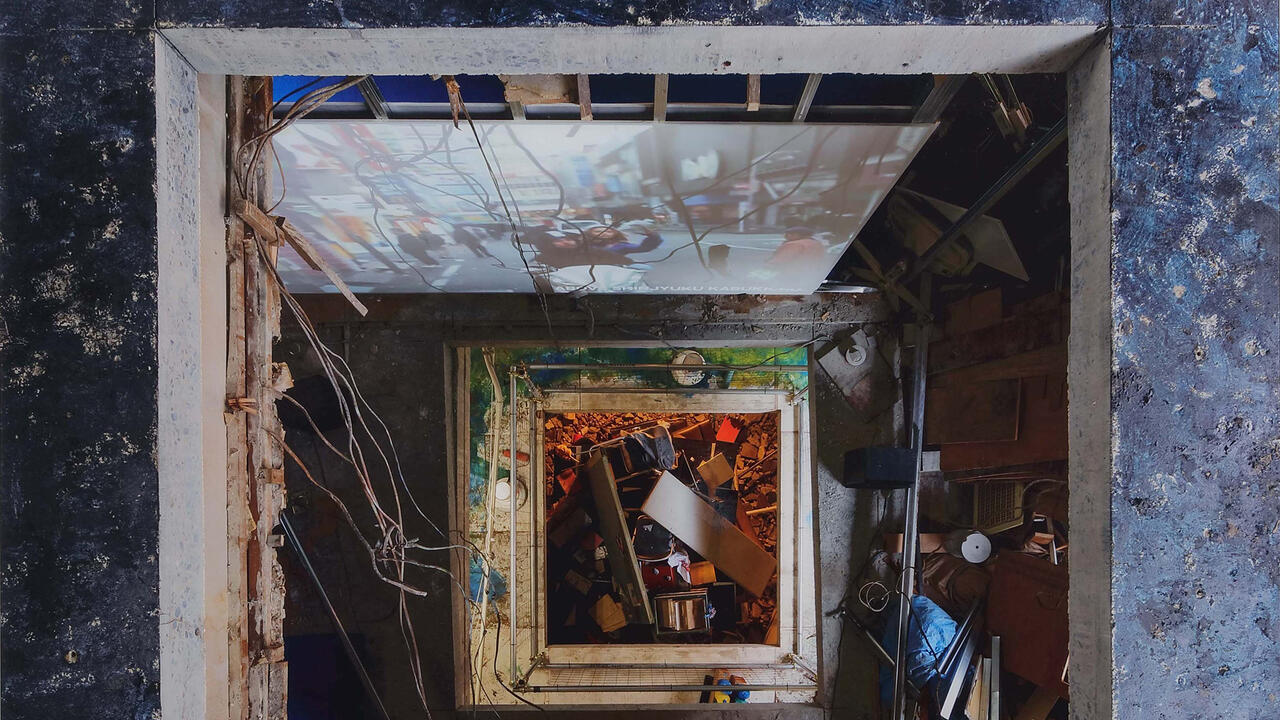
‘Video Hiroba: Rexamining the 1970s Experimental Video Art Group’
Mori Art Museum
30 July 2016 – 9 January 2017
The canonical history of early video art is told (in the west, at least) with a focus on the experiments of certain New York-based artists who are now acknowledged to been at the forefront of the period’s avant-garde: Vito Acconci, Dan Graham, Joan Jonas and Bruce Nauman, with a brief nod to Nam June Paik. There was, however, another ‘movement’ forming in Tokyo at the start of 1972, one named by the critic Tono Yoshiaki as Video Hiroba. Its key figures – Nakaya Fujiko, Wada Morihiro and Kawanaka Nobuhiro – were demonstrating robust engagements with the new technology, in light of the 1967 release of the Sony Portapak – manufactured by a Japanese corporation, we might note.
Several of Video Hiroba’s experimental videos are the focus of this retrospective, which reveals not only the members’ surety and immediate grasp of video’s aesthetic novelties, but its ability to be used as an instrument of social agency. Matsumoto Toshio’s Mona Lisa (1973) is technically extraordinary. Via a Scanimate video synthesizer, swirling technicolour hazes course over and obscure Leonardo’s iconic image, displaying unprecedented kinds of video-image manipulation against a pulsing electronic soundtrack. The Video Hiroba work, Documentation of “Video Picnic” in Zenpukujigawa Park, Tokyo (1972) documents an avant-garde performance hosted in the eponymous urban parkland, with the hand-held camerawork and playful cinematography capturing something of the frenzied, cathartic nature of the counter-cultural event. As this work demonstrates, Video Hiroba were not just innovating with video’s aesthetic possibilities, but also through their commitment to open collaboration and ‘anti-television’, used the technology to give public voice to local communities. In so doing, they evinced a far more media-activist savvy than their better-known American counterparts, an important factor that makes this exhibition as not only illuminating, but historically important.

Tomotsugu Manabe
Kayokoyuki
30 October – 27 November
With one eye on pre-historic Japan and one on the present, Tomotsugu Manabe fashions enormous sculptures that condense 10,000 years of Japanese history in a single bound – although it’s not so much the middle zones as the two ends that pique his interest. Tomotsugu is compulsively drawn to the Jōmon period (14,000–300 BCE) and its tradition of roughly hewn pottery, acknowledged to be one of the oldest in the world. This interest is juxtaposed with the contemporary genre of sushi known as Kazari-maki, a festive food made from coloured rice and nori, sculpted into decorative patterns or manga and anime figures. ‘12016’ merges these two enthusiasms by displaying a giant Kazari-maki of ‘ohana-gami’ (tissue for making paper flowers), polycarbonate and wood, opposite a rustically moulded clay vessel, the contours of which display a kinship with a Jōmon pot. While seemingly antithetical, the point of similarity lies in the construction: both forms are made through the action of rolling. A gendered subtext runs through the work: Jōmon pottery was traditionally only made by women, and Tomotsugu’s own Kazari-maki shows a beaming face whose curly-topped visage is intended to connote a mother. Goddess-worship, craft revivalism or food kitsch: call it what you will, this is irrepressible fun.

He Xiangyu
Scai the Bathhouse
28 October – 3 December
He Xiangyu is somewhat notorious for his work Cola Project (Extraction) (2009-11), which saw the artist boil 128 tonnes of Coca Cola, that emblematic commodity of capitalism, in his studio in Kuandian, China, until it turned into a sticky, seething reduction. These inverse alchemical experiments led He to be investigated by both the local police and the Environmental Protection Agency. However, the artist also has a longstanding interest in the colour yellow, having used it in many of his earlier works: as all-over paint on doors (Sorry, 2011-12), the sole colour in paintings (Lemon Flavored, 2015) or transmuted into gold and hidden in an egg (1500 g Gold, 62 g. Protein, 2013-14). In Chinese culture, yellow symbolises happiness and the ‘yang’ principle (the light to the dark of ‘yin’), while in the plant world it is classified as one of the carotenoid pigments that function to attract seed-dispersing organisms. As a spectral colour, yellow is a primary that cannot be separated into other colours nor produced by an amalgam of them – it is pure potency. These varied dimensions of yellow’s buoyancy are expressed in a new suite of radiant, delicate drawings: Eleven Lemons, Two Lemons and Sketches of Nine Lemons (all 2016). He takes cadmium yellow and makes it dynamic and reductive, haptic and astringent, all at once. In ‘Save the Date’, transgressive materialities are swapped for zest.

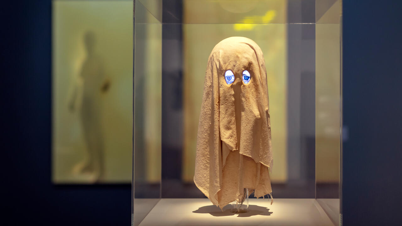
Korehiko Hino
SNOW Contemporary
10 November – 10 December
Part mannequin, part babe in the woods, the figures in Korehiko Hino’s paintings and sculptures are silky-skinned, androgynous and impossible to age. Often depicted with mouths slightly ajar and eyes glazed, they appear in realm of the quasi-living, suspended in a miasma that has arrested their development. Meticulous films of paint produce a sense of palpitating flesh that is undercut by the muteness of the figures’ expressions. In a key scene in the sci-fi classic The Matrix (1999), the character of Neo awakens to find himself immersed in a viscous fluid encased in a pod. Similarly, in Waterdrop (2016), a young man’s face drips with a transparent fluid that trails from his eyelids, forehead and mouth, yet the droplets are oversized and more akin to pearls or bubbles. In Hinduism, the bubble symbolises the brevity of existence, so it’s no surprise that Korehiko’s early works feature images of mirrors and wreaths of flowers – vanitas symbols of the transience of the mortal coil. Add to this Korehiko’s fascination with wigs, which curl and spill in earlier paintings such as Cosmic Perm (2010) and Night Hair (2010), and you will see that there is as much non-life as there is life in these eerily contrived worlds.

‘Moved’
Taka Ishii Gallery
21 October – 28 November
After many years in a gallery in Kiyosumi, Kōtō-ku, then a temporary occupation in Kitasando, Shibuya-ku, Taka Ishii has relocated to an expansive new premises in the Roppongi district. Its inaugural exhibition pulls out its big guns: Elmgreen and Dragset’s Couple, Figure 8 (2016) is a piece of rectilinear elegance in MDF, aluminium and stainless steel; Tomoo Gokita’s Blind Woman Can See It (2016), a disturbingly dramatic portrait using the language of collage – a large black gash obscures the sitter’s face as if blindfolded or masked in a threatening manner. Thomas Demand’s presence is more subdued with Daily #23 (2014), a dye-transfer print from his series ‘The Dailies’, which was originally designed to be installed in Harry Seidler’s eccentric circular building, the Commercial Travellers’ Association, Sydney, as the 25th Kaldor Public Art Project. Six prints by Nobuyoshi Araki are somewhat restrained in comparison to his more notorious bondage imagery, with black and white gelatin prints of naked ingénues adding a hint of understated eroticism to the grouping. ‘Moved’ is an enticing selection of distinctive works that augur impressive exhibitions to follow.

Katsuhisa Sato
Kodama Gallery
12 November – 24 December
The first thing that you will notice about Katsuhisa Sato’s paintings is their lolly-coloured exuberance. It’s a sprightliness of colour that is kept in check by both rectilinearity in form and non-objectivity of image. In the series ‘Ultra’ (2016), lozenge orange, fluorescent pink and cadmium yellow layers are blanketed over with silver, leaving only a slim line of colour visible at the canvas edges. In Face to Face (2016), rectangles of similarly glowing hues sit atop contrasting grounds in an extending band of panels like an array of swatches. But the minimalism doesn’t last long: A cartoonish element pushes through, with the duo-tone rectangles reading as doodle eyes and giving the band a comic ebullience. So too with works like Hometown (2016), a cardboard box with graphic signs of a tangerine, a ship and a bubbly cloud, and Hey Books (2016), where two blue hands meet in front of a cluster of cartoonish book spines. For almost a decade Katsuhisa has eschewed painting in favour of making photos and objects, so his return to painting is infused with a sense of happy-go-lucky re-discovery. Graphic minimalism and chromatic assurance fused with a bewitching bubble gum appeal.
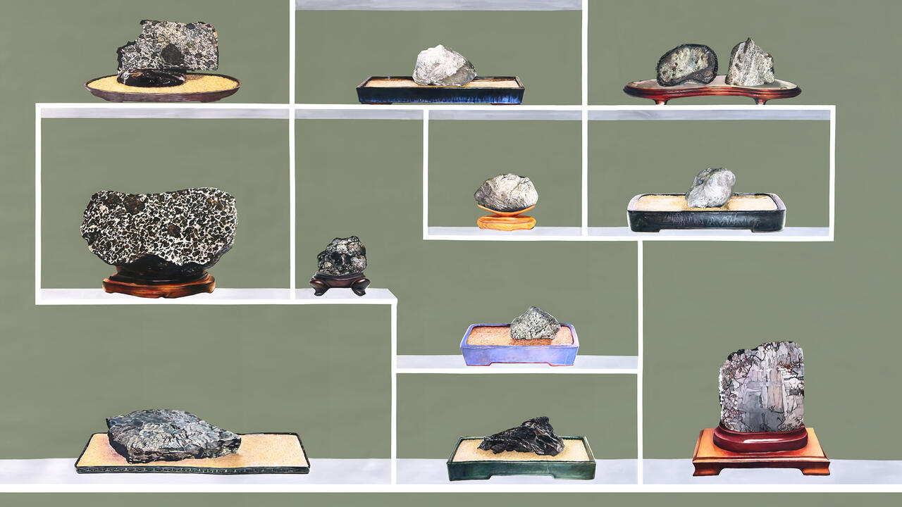
Lead image: Katsuhisa Sato, Star Falls (Crown), 2016