


Good Looking
The best graphic design must be more than decorative – it has to make sense of its subject
The best graphic design must be more than decorative – it has to make sense of its subject
The late, great Tony Arefin, designer of the finest art catalogues during the period from 1990 to 1995, used to insist that art was at its best when reduced to a five-by-four-inch transparency and placed on a tabletop light-box. It was a statement of designerly bravado that was intended to be taken with a pinch of salt. Tony saw as many shows as any of us, and his home was full of real, space-hogging work – but the claim that his portable light-box was the altar of art appreciation was more than a flippant quip. Its glowing rectangular top was the starting-point for a multitude of beautiful and clever designs, so, whatever went on when Tony gazed at its surface, it must have been something meaningful.
Tony had a huge influence not only on the founding of frieze but also on my first attempts to write about design. Absorbing his catalogues, it dawned on me that graphic design must be more than decorative, that its purpose is to make sense of its subject. Good-looking pages are worthless without intelligence. The impact of his vision was both immediate and cumulative; following his work was akin to the regular reading of a trusted critic. Tony’s take on the art of the early 1990s often made me rethink my perceptions, and now, more than a decade later, his designs are redolent of the period in a way that renders datedness a virtue.
It may seem contrary, but I tend to read catalogues back to front, checking out the credits, the colophon and the treatment of the mundane material, biographies and the like, before going to the book’s more glamorous, front-of-house section. Since my epiphanic encounter with Tony’s work I have come across a clutch of other designers who can be relied on to amplify rather than diminish their subjects, particularly when dealing with art. Some of them are showmen, such as J. Abbott Miller, whose fabulously hefty design for Matthew Barney’s The Cremaster Cycle (Solomon R. Guggenheim Foundation, 2003) serves as both key and monument to the films; others are more restrained, such as Lorraine Wild, whose quiet emphasis has shed light on the work of Ed Ruscha, Catherine Opie and Liz Larner, among many others, while retaining a distinct tone of voice. Disregarding the traditional tenet that graphic design must be anonymous, these designers bring their own insights to their projects, and the publications are all the better for it.
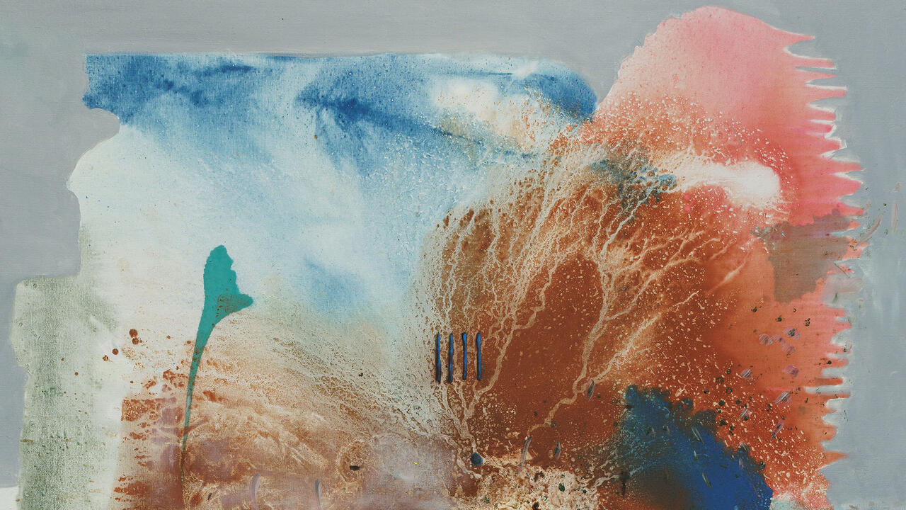
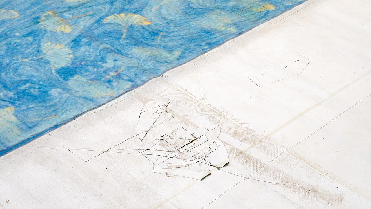
Among the most controversial issues raised by catalogue design, and design for art in general, is that of cropping. Some art institutions go as far as banning designers from using cropped pictures and, when they are allowed some freedom at the edge, art audiences are quick to complain. This apparently reflexive objection irritates me. Of course, crops that reduce art to decoration or background noise are unnecessary and stupid, but why automatically condemn clever cuts that bring your attention to an element of a work that you might have overlooked? Once you have become acquainted with a designer’s approach, you begin to appreciate their particular take and emphasis. The choice not to show the entire image has become an emblem of all unwarranted designerly incursion. My defence of it is, by extension, a vote in favour of graphic ambition.
Eventually it all boils down to questions about the purpose and function of books about art. It would, for example, be absurd to take liberties with the pictures in a catalogue raisonné. Among the best instances of apposite graphic puritanism is Derek Birdsall’s brilliant design for the Rothko catalogue (Yale University Press, 1998), in which all the paintings are shown in scale with each other. Rather than creating a drama from the assembled Rothkos (a temptation for any graphic designer), this book tenders illustrations as diagrammatic representations of the works. But whatever the virtues of the determinedly conservative catalogue, the assumption that a publication about art can never be more than a record is extremely reductive. In general, books that play and probe are so much more engaging than those that simply represent. And, if a certain volume is not to your taste, leave it on the shelf and be grateful that the art survives independent of print. The ephemeral nature of graphics is a quality that all the best designers embrace, leaving the misguided ambition of timelessness as the preserve of the pompous and unimaginative.
Reading through the last few paragraphs raises the spectre of a straw man. I am sure some of you think I am imagining the craven guardians of art who complain about every crop and juxtaposition, particularly given the increasing number of artists who are fascinated with graphic design to the extent that their work is indistinguishable from it. But, whatever the current enthusiasm of artists for design, I know an ambivalent relationship when I see one. And if I had a well-designed art book for every time that someone had said to me, ‘But you can’t see the work!’, I would own the library of my dreams.