Against Interpretations
How does Édouard Glissant’s demand for opacity translate into art? Jan Verwoert explores opacity as a model for open communication – and outlines a history, which runs from Lygia Clark’s sculptures to Trisha Donnelly’s enigmatic films
How does Édouard Glissant’s demand for opacity translate into art? Jan Verwoert explores opacity as a model for open communication – and outlines a history, which runs from Lygia Clark’s sculptures to Trisha Donnelly’s enigmatic films

Hope lies in the inscrutable. When it doesn’t have to serve as a justification for anything, when it need not apologize for anything or obey any format. But when, instead, it shows itself openly as something that stands between us, even when we’re communicating with one another, in fact especially at those moments. Like the irresolvably strange, unspoken or unspeakable quality resonating in a particular choice of words that makes total sense although we can’t quite say why. Or the quality that makes certain looks and gestures meaningful, precisely because they are ambiguous. Or an accent which, whether we like it or not, carries the voices of the places where we learnt to speak.
This is how I would understand Édouard Glissant when he writes that the opacity of the poetic does justice to the density of lived experience. In art, he writes, the opaque is manifested in ‘tous les détails des lieux du monde, sans les offusquer jamais’1 – the specificity of local detail, wherever in the world; the flavour of an utterance; the contours of a horizon of experience, without these things being kept secret or rendered uniform in any way. Glissant is certainly not advocating obscurantism here. The kind of opacity he is talking about cannot be deliberately created or claimed as the ‘roots’ of an identity or multiplied as capital. Opacity belongs to no one. In fact, it emerges only when left to itself – when those involved in an exchange accept, intuitively, wordlessly and of their own accord, ‘allant de soi’, not merely to fix the literal meaning of an utterance, but also to pay attention to everything that resonates in the sound of a voice and what a text or art work expresses inexpressibly in all the aspects of the way it is made.
The free choice to be attentive to opacity, Glissant writes, generates ‘une relation de pur partage’2 – a relationship of pure sharing, a distinct social contract based on silent trust. Glissant’s plea in favour of opacity is thus by no means a gesture of refusal. Instead he calls for an even greater willingness to engage in exchanges using the means of art. Without crutches. Without relying on the false security of prefabricated meaning, promises of utility value and status codes. Opacity is not a category to be fulfilled, nor a criteria to be met, nor a claim to be substantiated. The opaque aspects of a work may indeed underline the special local origins of a word, image or sound. But the truth here lies in the details – to such an extent that, in the light of the specificity of these details, any generalizations about author and work necessarily appear empty.
For the same reason, opacity is not an element of style to be learnt and deployed. Exercises in stylistic refinement never really achieve density, which is more likely to be reached when someone is not afraid, in the creative process, to surrender to some small degree to the rhythm and rhyme of things thrown up by the world around us – and to hear, in the eloquent silence of the material, the voices of today’s social reality. To produce art, then, that takes a vernacular material idiom as its medium and uses it to hatch the cuckoo’s eggs of opaque expression.
Lygia Clark’s Bichos (Insects) from the 1960s are unsurpassed in this respect: a series of sculptures made out of metal plates the size of playing cards, connected by countless hinges. The sculptures are made to be handled and played around with, folded, unfolded and refolded, changing the constellations of the plates, like the faces of a Rubik’s Cube, but without the possibility of reaching a solution. Which doesn’t exist. Consequently, the sculpture is eventually laid aside so that someone else can continue folding this thing that no one is able to define clearly. The object’s format and function remain opaque although anyone can touch it, alter it and pass it on. It’s like a philosophical concept that suddenly becomes common currency even though no one knows precisely what it means, but that everyone feels might be significant.
The spirit of a thing is often far more strikingly revealed in the opacity of an expression than in its nameable meaning. Political mobilization without propaganda? Sister Corita Kent showed the way! In the 1960s, in her workshop at the Immaculate Heart Convent in Los Angeles, she produced screen prints for posters, book covers and murals with slogans against the Vietnam War and for a non-violent society. The language spoken by her designs could not be clearer. But her graphic approach explodes any format. The writing stretches, undulates and spreads dynamically across the space. Kent mixes her colours more freely than the most abstract Expressionist and as freshly as the best Pop artist. These formal qualities of the prints are opaque and do not propagate clear messages. They are far too distinctive and free for that. But precisely this approach makes the viewer feel what s/he might have against the bomb and why, in the light of the West Coast, a better life seems possible than a life of military service for the nation.
Speaking in the spirit of opacity means speaking freely, not having to talk, but talking nonetheless – or not. Kent’s works could consist of only shapes and colours. In formal terms, they would be just as good. Words are not essential. But precisely because they are not essential, they make a greater impact when they appear in the picture. Because they do so freely, without obligation.
To prevent articulation from becoming forced, it must always remain possible to do away with it. Art should not be obliged to perform anything; it should always be permitted to leave the curtain shut, if it so desires. And in any case, the opaque texture of a work (to paraphrase Jacques Lacan) is like a veil, which, rather than hiding something that might be uncovered, simply lies there in folds, this way or that, and thus speaks volumes.
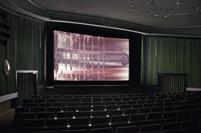
Trisha Donnelly has an eye for this veil-like quality in the visual realm, and she pursues it in works like her film Untitled (2010–ongoing). The work shows video material that has spent so long in post-production that little more remains than a kind of opaque film on the surface of the stream of digital images. The film moves with an odd viscosity, changing with each new wave of images, sometimes expanding into reddish-brown patterns, then congealing to digital gelatine in silvery streaks. This veil is too concrete to magically enhance the pictures. Still, the film is compulsive viewing. One’s gaze becomes lost as in the swirling patterns of oil on water. Here, opacity is elementary because it is a purely superficial phenomenon. It can no longer be assessed in terms of conventional categories. One really cannot say whether Untitled is the alchemical quintessence of today’s visual culture or a bunch of sweepings from the cutting room floor. And that is precisely the point.

In Kara Walker’s work, this free play of images resulting from an engagement with opacity is not purely formal but also possesses a historical dimension. Her preferred medium is figurative silhouettes cut out of black paper and arranged into life-size scenes. Installed on a white wall, they appear as moving shadows. From the outlines, one can guess that the clothing and hairstyles (or wigs) are from the North America circa 17th–19th centuries. Slaves, maidservants and their masters are the figures in this game, whose action consists of kitchen scenes, lynchings and all manner of sexual services. Here, horror is an ink blot out of which Walker delights in conjuring a succession of figures. Their opacity consists in the absurd level of detail in their outlines. But also in the libido they convey. Walker transforms history into a violently pornographic shadow-play in which she frequently takes on the leading role herself. Walker’s Afro-American women often bear her own traits. She is every woman of two centuries (and, if she wants, also a wild boy like Huckleberry Finn), in every position, diabolically self-confident, through every ordeal. The men of old don’t have the last word – Walker does, based on a desire that is twisted in all directions with unplaceable queerness. Walker’s work is like a teardrop provocatively tattooed onto the Statue of Liberty’s cheek. Like the beard of the bearded lady it is a veil one cannot lift, as it is what it is, in, by and for itself.

Bonnie Camplin’s videos are about media becoming uncannily opaque. What is it like to live behind veils of media? she seems to ask. Get me a Mirror_(2006) opens with a disembodied face floating against analogue image noise on a screen with an edited-in fly crawling across it. A woman, copied into the image in red, green and blue, dances with herself. Then come drawings of ladies in a series of uniforms, pestered by digital flies. Finally, voodoo masks appear out of the darkness while an actress puts on make-up: Assemble your own self, but beware of digital vermin! Protection may be offered by a screen of images – or, more traditionally, a fan! In _Colonial Fanny (2005),
Camplin waves one in front of her face the whole time and, like an insect with mimetic powers, she merges with the ornamental surfaces of wallpaper and upholstery. Then the fan changes into a butterfly and flutters out of the projection – a blind spot with wings.

All of this is of no use to anyone, the opaque quality of these works answers no questions of status or meaning, and has no value in terms of distinction. Most importantly, and without making any gesture of refusal, these works don’t represent anything. There’s no deliberate wildness either and they don’t obey any format. They are opaque. Which is why they speak so clearly of what they mean when they are given to be seen.
Translated by Nicholas Grindell
1 Édouard Glissant, _Philosophie de la relation. Poésie en étendue_, Gallimard, Paris, 2009, p.70
2 Ibid. p.69


