


Blinky Palermo
Museu d'Art Contemporani de Barcelona, Spain
Museu d'Art Contemporani de Barcelona, Spain
Like Eva Hesse or Bas Jan Ader, Blinky Palermo is one of the auratic figures of postwar art. When he died in 1977, at the age of 33, he left a body of work that stands out by virtue of its sensuous beauty and conceptual rigour. Because of the artist's untimely death the work is charged with the sense of a great but only partially realized potential that subsequently influenced artists such as Imi Knoebel and Günther Förg.
Palermo was born in 1943 as Peter Schwarze; then, after being adopted, his surname was changed to Heisterkamp. In 1962 he joined the Dusseldorf academy to study with Bruno Goller and Joseph Beuys, and around 1964 he took the name Blinky Palermo, after the mobster manager of boxer Sonny Liston. For over ten years he exhibited widely before dying in unclear circumstances on a trip to the Maldives. It's tempting to allow the delicate sensitivity of his art, allied to his defiant Beatnik looks, his traumatic childhood, introverted personality and heavy drinking, to create an image of a James Dean figure. That would be myth-making, but one that's hard not to accept when you hear the story and then see the work.
There have been retrospectives of Palermo's work at regular intervals over the last few decades. Reassessing his work in this exhibition (which travels to London's Serpentine Gallery) is like trying to grasp the elusive essence of whatever it was that made art change so radically in the 1960s. Indeed Palermo's work can be seen as exemplifying an important transition from the Romantic concept of art (as a vessel for transcendent meaning) maintained by his teacher Beuys, to the materialist concept of art (as a response to mundane visual culture) proposed by his fellow students Sigmar Polke and Gerhard Richter. Palermo somehow straddles these two approaches, his work departing from Romantic symbolism and moving towards materialist literalism without ever fully arriving at a resolution.
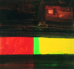
Romantic notions of the mystical and Sublime are invoked explicitly in watercolour drawings such as Hymn to the Night (for Novalis) (1966) or I + II Good Friday (1970), which in their fragility recall Beuys' sketches. The materialist antidote to these works is provided by the so-called 'Stoffbilder' (Material Pictures), a series of abstract compositions created from 1966 by stretching commercially available coloured cloth. The subjective mark-making celebrated by the watercolours is offset by geometrical abstractions such as East-West II or Cardinal Points I (both 1976), painted in acrylic on metal. Here paint becomes surface coating, all depth is denied and the compositions have the unambiguous clarity of traffic lights.
The most fascinating pieces, however, are those situated somewhere between the extremes of romantic expressiveness and cool literalism. In 1964 Palermo began producing shaped canvases he called 'Objects'. White Triangle (1966), for instance, is a small triangular white monochrome installed over a doorway. Physically the painting marks the space like the stripes of Daniel Buren. At the same time, however, its shape resembles the religious symbol for Trinitarianism, God's eye framed by a triangle; its objecthood is invested with a trace of the Sublime. The same holds true for the wall paintings begun by Palermo in 1968 (documented through sketches and photographs). For Fenster I (Window I, 1970) Palermo transferred the outline of the mullions in the glass shopfront of a Bremerhaven gallery on to the exhibition wall as a graphic grid, thus combining analytic precision with the wistful gesture of capturing a shadow. For his untitled work at Documenta 5 in 1972 he painted the end wall of a landing in the Fridericianum with an orange rust-preventive undercoating - a mundane staircase turned into the site for an immediate experience of colour.
A similar experience was recreated by the MACBA's reconstruction of the installation The Four Cardinal Points, which Palermo made for the Venice Biennale in 1976. In each corner of a disused industrial space a billboard-sized rectangular panel was placed at 45° to a steel girder. One panel was black, one white, one red, one yellow. Although the room was thus defined by abstract co-ordinates of colour and form, it retained the roughness of physical space. The sensation of seeing a sublime work was thus grounded in a bodily experience, the reality of which transformed the purity of the colour panels into something broken, intimate and almost tender.


