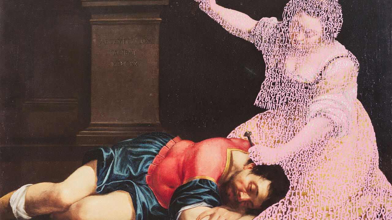


Color Chart
The Museum of Modern Art, New York, USA
The Museum of Modern Art, New York, USA

When I started learning about the art of the 1960s, about ten years ago, the period seemed book-ended by two texts: Clement Greenberg’s After Abstract Expressionism (1962), which accounted for the importance of colour in the paintings of Barnett Newman and Mark Rothko, and Lucy Lippard’s Six Years (1972), which chronicled the work of countless Conceptual artists. Colour seemed anathema to the latter group, who, one initially supposed, banished it from their work. But once one took a closer look at Lippard’s artists, it became clear that almost all of them were interested in colour – just not in the way that had been important to their predecessors. Colour instead was interesting as a ready-made material, as a product of new industries and technologies. Colour was something to be not so much mixed on the palette as found on cars and clothing or in domestic interiors. Curator Ann Temkin’s ‘Color Chart’ examines at this alternative approach to colour, concentrating on the 1960s but looking back to Marcel Duchamp (the colour swatches in Tu’m, 1918) and forward too.
The first few galleries were the strongest parts of the show: it was wonderful to see Tu’m and Robert Rauschenberg’s Rebus (1955) in one glance and clever too, to have Frank Stella’s six-part suite of paintings from 1962 (once owned by Andy Warhol) brought together with a set of Warhol’s six smallish Marilyns (1962), a chromatic juxtaposition that did much to undermine any residual claims that posit a complete separation between Minimalism and Pop.
One of the show’s strongest arguments was to indicate how colour became a battlefield on which younger artists confronted their elders. The ways in which they fought revealed much about their sensibilities. Bas Jan Ader’s arrangements of flowers in Piet Mondrian’s colours (Primary Time, 1974) was a tender skirmish, and a witty one (all those green stalks would have infuriated the Dutchman). By contrast Richard Serra fought Joseph Albers (his former teacher) more aggressively. In Color-Aid (1970–1), shown as a video but which makes better sense as a film, Serra let the camera frame be filled with a single colour. From time to time his finger intrudes into the frame to remove the colour, which we realize is a sheet of card in a stack of the kind that Albers used to teach with. As each sheet is removed, we begin to concentrate less on the papers’ colours than on Serra’s fingers. As they press down, blood drains out, turning them from pink to yellow, but the dirt under his nails is pretty constant. Serra thus exchanges the colour combinations that the cards might provide with the real colour of the body.
‘Color Chart’ also revealed how the most seemingly ordered and anti-subjective approaches to colour generated unexpected affects. Blinky Palermo bought off-the-shelf cloth and simply stitched lengths together, but the straightforwardness of this process belies the optical play generated where a blue meets a red in Untitled (1969). Alighiero Boetti had square panels coated with industrial paint whose brand names he then attached to the panels, using letters made of painted cork. For all that this seemed to be about doubling (the work presents both a colour and its name), brand names such as ‘Oro Longchamp’ don’t just identify the colour: they set our thoughts on metals and racecourses. This vaguely humorous operation was picked up by John Baldessari and especially Bruce Nauman, whose photocopy of a colour chart replaced its colour with a range of greys that have since turned to browns.
It was a surprise that Temkin decided not to include the work of Brazilians working so intently with colour at this time. Even if they did not use colour charts, the ‘rules’ of her exhibition seemed flexible enough to have included, for instance, Lygia Pape’s Wheel of Delights (1968), a circle of bowls of unpredictably flavoured coloured water. Such quibbles aside, the historical parts of the show made significant arguments that will surely alter the way this period is understood. The latter sections were more problematic (around a third of the space was devoted to work of the last 15 years). It was certainly important to indicate the ways in which more recent artists have addressed colour and race together, but some of the works did little to demonstrate really new thinking about colour. Thankfully, the show closed with a piece whose quirky humour matched its experimental intelligence. In 2000 Christopher Williams attempted to record the brand colours of Agfa, Kodak and Fuji by using film and developing materials produced by each company to photograph a dishwasher stacked with plates whose colours corresponded to the companies’ logos. (For Kodak the plates are mainly yellow with some red.) This investigation into the connection between commerce and colour picked up a strand from the earlier part of the show, but Williams was also able to point to a moment of failure: Agfa’s products cannot, he realized, accurately reproduce the company’s own brand colours, which come out too red. If many artists in the show seemed to celebrate the new colours of an industrial world, by pointing to this tiniest discrepancy between a brand’s image and its product, Williams laid the confidence of capital to question.