


Slices of life
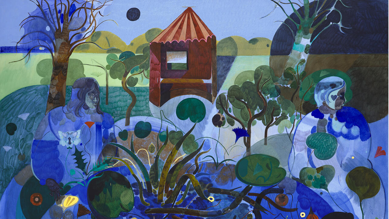
Thomas Scheibitz
Thomas Scheibitz

While most of us imagine Classical sculpture as pristine marble, a recent reconstruction of a Trojan archer from the Temple of Aphaia, Aegina, shows that the figure was originally painted from head to toe.
On show at the Glyptothek in Munich the statue features meticulously rendered lozenge-patterned leggings and sleeves. It has been suspected for some time that colour was used to render skin and clothing on ancient statues, but this has been played down as a minor detail, an unfortunate mishap in an otherwise great period. One line of thought running from early Neo-classicism to late Modernism insisted that Classical marbles had to be pure white; that painting and sculpture had to be kept separate.
I came across a newspaper cutting on the Trojan archer in the studio of Thomas Scheibitz. It was probably lying on the table by chance, but it seemed to wink subtly at me, as though placed there on purpose. Scheibitz' studio comprises three rooms in a Berlin warehouse: one is reserved for oil paintings, one for works on paper, and the third for sculptures and objects. The spaces are not interconnected: you have to cross a hallway and a staircase to get from one to the other. It's sufficient distance for you to whistle a tune and forget about mushy crossover ideas, but close enough for the artist's methods to interact dynamically.
The separation of Scheibitz' working spaces loosely echoes his history: from 1991-8 he studied in Dresden, where, after taking a detour from his earlier crude wooden constructions via painted reliefs, he concentrated on painting from the mid-1990s onwards. (He first achieved recognition together with Eberhard Havekost and Frank Nitsche, but attempts to present the three of them, 1980s-style, as the Dresden 'gang' didn't last long, not least thanks to Scheibitz' own reluctance.) While employing the whole gamut of painterly approaches to colour (predominantly pale and plain, but also bright and pasty, using oil, gouache, vinyl and pigment-marker), compositional push-and-pull (flat colour planes flickering against suggestions of perspective and space; interlocking fields in preference to superimposed layers) and hide-and-seek between abstraction and representation, he quickly carved out a niche for himself. You might be tempted to describe a picture such as Toy (2000) - a shock-frosted rubber duck with Picassoid eyes - as Neo-Cubist Pop, but generally the compositional technique is too much about seams and not enough about icons for this to be an adequate description.
Over the last three years Scheibitz has reintroduced sculpture into his practice, with a vengeance. Like his canvases, the sculptures are full of sharp angles, jagged juxtapositions and awkward couplings. This is probably the only aspect of his work that provides a link with Dresden, a city in which any idea of purity must seem like a really bad joke (once voluptuously Baroque, it was scarred first by devastating bombing during World War II and then by socialist urban development). Scheibitz ploughs through the heaps of used forms and out-of-style poses, but the results are neither revisionist pastiche nor copies of iconic motifs. Like many artists, he keeps clippings of images culled from the press. Flicking through some of them, I saw a picture of a ski-jumper just after landing, arms and legs in the air in a weird mixture of triumph and trying to keep balance. His body and skis combined to form a 'Z' shape, like Charlie Chaplin in a piece of Yvonne Rainer choreography. Neither the ski-jumper nor any other image will end up being directly copied but the geometry and 'vibe' of his gesture might. Scheibitz' works seem to be made from the perspective of a child wearing three pairs of differently shaped and coloured sunglasses on top of each other, seeing the world cut up into funny slices. Often there is the beginning of a roof or a tree, icicles or a letter (especially letters with sharp angles). In this sense (though the slices are depicted, not actually inflicted), Scheibitz is closer to Zorro than to Lucio Fontana, closer to rapture than rupture.
A.B. Bank (2000), the most imposing sculpture in a one-man show held at the Stedelijk Museum, Amsterdam, in 2001, is a true mutant. It is constructed from pieces of MDF (some curved, some straight) and painted (rashly or uniformly, semi-transparently or opaquely) in different shades of white, grey, blue and red. The result looks like larger-than-life chunks of alphabet soup cobbled together to form a robot pony. As with most of Scheibitz' pieces, the title is neither simply descriptive, nor does it load the work with a definite meaning that the viewer would otherwise fail to grasp. A.B. Bank is an allusion to the alphabet, and to the two meanings of the German word Bank (both financial institution and bench): so this is a bank trading in letters of the alphabet, or a bench made out of them. But neither of these meanings seems adequate; the thing is just too hybrid. The relation between the material object and language is inverted: the object seems to float between possible meanings, while language turns heavy and intractable, like lettering carved in marble. (Scheibitz' father is a monumental mason.) Thus the whole tired discussion about figuration versus abstraction, visual versus verbal, and painting versus everything else, literally (you can almost hear it creaking and clattering) falls apart.
And yet with A.B. Bank you could still imagine venerable discussions about the nature of pictorial sculpture: about how successfully the compositional elements and colours form a precariously tense yet ultimately balanced whole. However, with Hannibal ad Portas (Hannibal at the Gates, 2002), one of the central pieces in an exhibition at Produzentengalerie Hamburg in late 2002, the mere act of describing the work makes you feel pedantic and slightly stupid. A table-sized, flatly painted platform (unfinished at the edges) hovers just above the ground; on it the artist has created a tableau, a kind of volleyball for extra-terrestrials. A sheet of ultramarine Perspex is held by two bamboo poles, one slightly longer than the other. It divides the baby-blue field at a slight angle into what looks like a children's crown on one side (little white fence posts loosely knitted together to form a circle) and a cross between a bouquet and a TV aerial on the other - a metal ball on a stick planted in a kind of cup, surrounded by four longer, mint-green sticks. So who plays this game, and to what end? Certainly, the relation between the elements of the piece could be described, in terms of compositional abstraction, like weights on a set of scales. But the title Hannibal ad Portas only confirms that there is a thin line between the sublime and the downright silly, as you try to interpret what you see in terms of Hannibal's elephants crossing the Alps to descend on Rome. You could speculate whether Scheibitz is alluding to his solo exhibition at Tanya Bonakdar Gallery, New York, held while the US was preparing to go to war; but ultimately the piece turns any attempt along these lines into plain travesty, and I see that as its pun.
The New York show literally spelt out, while still managing to conceal, the basic relation between form and meaning. Its title, Maus Appetit Dezember (Mouse Appetite December), was taken from an international research project in which people from around the world were given simple, everyday words and asked for their meanings and associations. The exhibition was not concerned with the findings but with the basic proposal - an answer to what those three words might ultimately mean was not offered except in deadpan sculptural and painterly form. There was a large work on paper in gouache, oil, charcoal and pencil (wryly suggesting that myriad meanings call for myriad means), using the three words of the show's title in a crude typography, Maus Appetit Dezember (2002); and an even larger four-part gouache of a spy satellite's view of a landscape punctuated by mysteriously organized dwellings - a sort of prehistoric Stonehenge airport, Maus Appetit Dezember (2001-2). The central piece, however, was a sculptural work: a multi-level, multi-angle platform suggesting a close and systematic link between the seven objects positioned on it, which were combined to form one piece and bear the same title as the two other works, Maus Appetit Dezember (Sculpture) (2002). Making these seven odd objects on the platform must have involved all the fun of imagining helpless viewers trying to describe them in detail to others who hadn't seen the show. Let's call them: the Cyclops TV tower, the see-saw church, the drive-in rabbit, the promiscuous flag-post, the Christmas star puppy, the red letter house on tiptoe, and the bikini wigwam.
I leave it as an exercise for the reader to relate the mouse, appetite and December to any of these things, but I suspect that the point is that it would be beside the point: these are absurd design objects - 'ducks' to use Robert Venturi's term for buildings that sublimate decoration into their overall iconic shape. Scheibitz' sculptures embrace the idea of endless mutation and ruthless joy on the basis of a shared, practical, anti-hierarchical, maybe even universal, grammar of form. What they reject is any idea of the universal as prescriptive, as determining what is accepted as valuable, as a set of pristine, classic forms.


