Emigre Ugly Faces
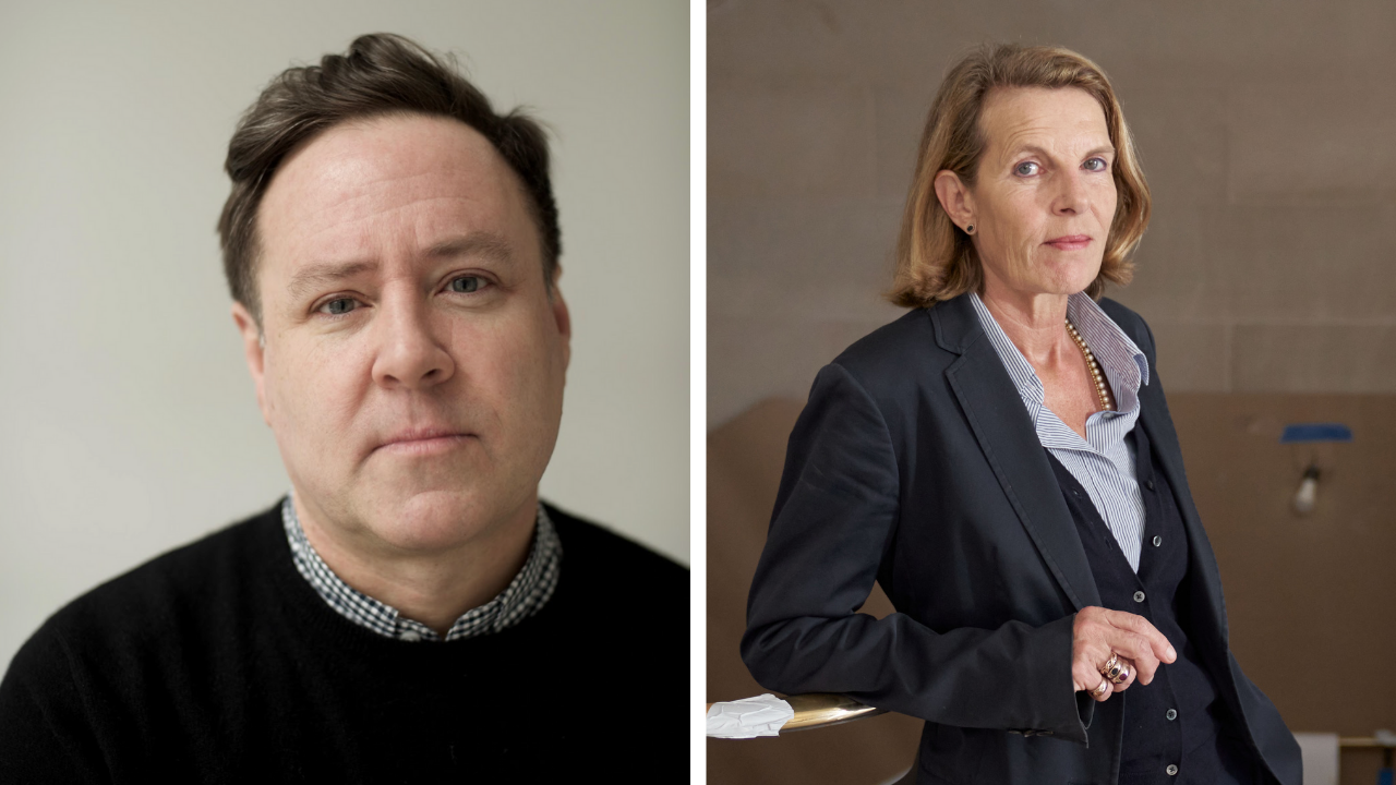
From Virtual Reality to Computer Graphics, the media has made much of technology's impact on the culture industry. Nowhere has this impact been more visible than in the field of Graphic Design. Emigre, a small group of West Coast designers, are at the forefront of the field, publishing typefaces that are demanding of designers and readers alike. Stephen Mayle spoke to Rudy Vanderlans, Editor of Emigre.
From Virtual Reality to Computer Graphics, the media has made much of technology's impact on the culture industry. Nowhere has this impact been more visible than in the field of Graphic Design. Emigre, a small group of West Coast designers, are at the forefront of the field, publishing typefaces that are demanding of designers and readers alike. Stephen Mayle spoke to Rudy Vanderlans, Editor of Emigre.
Desktop Publishing, or more specifically the Apple Macintosh computer, has opened the floodgates for typographers. Much like the way in which the Kodak Brownie transformed Photography 100 years ago, now anyone with access to a Macintosh can design their own typeface, put it on a disk and sell it.
Rudy Vanderlans and Zuzana Licko piked up on the potential of the Macintosh in its early years. They now publish a quarterly magazine, Emigre, typeset in computer typefaces, or fonts, that were designed by Licko herself. These distinctive fonts, such as Matrix, Modula and Senator, are now used everywhere from shopping malls to art catalogues. Vanderlans, editor of Emigre, explained how they began.
'It started out in 1984 as a way of publishing my own work, which was photography, and the work of two of my friends, a writer and an artist. Very naively, we thought that not being able to show in a gallery, what better way than to start your own magazine? There was no editorial plan. Or financial plan. We didn't know anything about magazines. So in the beginning, for the first seven or eight issues, it was a collection of everything – poetry, film, architecture ... most of the work was from people in our immediate environment.'
In fact, The Macintosh was not around when Emigre was launched. Issue 1 was produced with a typewriter and Xerox machines. 'We were working on Emigre #2 when the Macintosh came out in 1985, and we were very close to the fire in Silicon Valley. The Macintosh caused such a shock within the graphic design industry, it really turned things upside down.
'It was a very low resolution computer at that time, and the only output device was an Imagewriter, which also has very low resolution output. Right after we got the Mac, a program called FontEditor came out, which allowed you to create your own bitmapped fonts on the screen. Zuzana picked up on that medium and though it was a gas. Of course, graphic designers have always been able to design their own typefaces – everybody can draw – it's just been very difficult to be able to use them. But on the Macintosh you could actually make up your own typeface, store it on the computer and then access it through the keyboard.
Certainly the fonts are the most visible side of Emigre Graphics. They are not beginning to appear in more adventurous graphic design in the U.K., but they seem to have taken America by storm. Vanderlans agrees. 'They're everywhere. Warner Brothers records have bought the entire library. Television companies such as ABC and NBC have picked up our fonts. We see them published daily. Only yesterday we were in a record shop and we counted 35 album covers using our fonts. Even Esquire magazine, which none of us would ever have thought.'
Despite this apparent proliferation, some designers feel unable to use Emigre fonts. Malcolm Garrett of Assorted Images reportedly finds them too strong – their character completely dominates the design. But it is this strength that attracts other designers. Tony Arefin designs art catalogues for Arefin & Arefin. 'What I like about Matrix, Senator and Modula is their rawness; they have an unfinished quality to them. They say "Well, fuck you, this is what I am – You either use me or you don't." I'm really proud of using them.'
So isn't Arefin using these fonts to show other designers that he knows what's going on? A touch of Design about Design? 'As in "I am where-it's-at"? 'I use Matrix because I really like Matrix. It's really legible. It ha all the qualities that I want in a typeface. I like Modula and I like Senator because they're what I'd call really good display faces. There's this typeface called Corvinus which is really old, an exquisite typeface, and Senator is like its modern equivalent.' But Arefin feels that some of the more recent fonts are too conventional. 'Look at Triplex – to me it doesn't work. It doesn't have enough of a quirk of its own.
It's not asexual enough. I think every typeface has a sex – either they're very sexy or very ugly ... maybe this is what happens when you work on your own. Like Otl Aicher's Rotis. Rotis to me is complete state of mind – there is a place called Rotis and he works at this place called Rotis and it fits in with this philosophy of everything being Rotis. You can imagine the Rotis police and so on. That kind of purity appeals to me, his single-minded but dogmatic vision. Whereas Emigre's recent fonts are trying for a fineness while remaining quirky, and it's not working. I can't use them.'
Vanderlans sounds like he's heard it all before. 'Everyone has their own problem with Emigre fonts. There's so much snobbery around. When Univers first came out it had a very particular style. Sure, when you use a certain typeface that is married to a certain technology or a certain time period it will always carry that luggage. If I look at 8vo's work, with all their use of sans serif typefaces, it immediately reminds me of Wolfgang Weingart and Armin Hofman – you can't get around it. Typefaces are and should always be an embodiment of a certain time period.' Typographers are an exacting breed, and there is a sense that Emigre have rattled a few cages.
'It's all divided up into two camps. There are people who think that type is sacred as it is, and there are people who don't think so. And that's what we expected. We've had our share of criticism, especially when we were working with bitmapped, low resolution typefaces. It was called the deterioration of typefaces, or breaking the language of art – and that's ridiculous. At least to us. I think we know that next to a more traditional type designer, our type is a little harder to decipher. But that's now – ten years from now, when everybody is using Modula ... It's also to with your reference point. Traditional type designers always measure everything as if they're designing books. We're not involved with books. We design magazines and posters.'
Emigre's success has paved the way for a generation of Mac-literate designers to start designing their own fonts. Erik van Blokland and Just van Rossum met while studying graphic design in Holland. These designers in their early twenties have created Beowolf, the world's first random font. Their view, in common with Emigre, is that the Mac has been used too much simply to emulate conventional typography. With digital fonts, for instance, there is no reason that each 'a' of a certain font should look the same. Enter the random font, that prints differently every time it is used. They see the future providing fonts which alter as the weather changes, or which decay gradually until a specific sell by date, when they become illegible. Indeed, Jonathan Barnbrook, a recent graduate from the Royal College of Art, has designed a font called Burroughs. The printed version of Burroughs bears no relation to the words you see on the screen. Instead it prints 'nonsensical poetry' by randomly accessing a computer dictionary.
This new generation of typographers encouraged by pioneers like Emigre, may soon eclipse their mentors. Stuart Jensen of Fontworks, London, agrees. 'We've got to the point now where Emigre is almost the establishment. Almost in the way that Brody is. It's a joke. They've made their name by being radical, and suddenly they're verging on staid.' Jensen sees new a new magazine called Diffuse as the most interesting development in the field. 'Diffuse will have a disk attached to it which will include typefaces at various stages of completion. Readers will be able to play with the fonts, take them further and send them back. This should open up a whole platform for experimentation and hands-on-usafe. If you end up with something really good, the font will be finished off, with the kerning pairs and so on, and be released.' Fonts will be arranged around specific themes, the first one being 'to see how far you can deconstruct typefaces and still recognise them.'
Perhaps Emigre graphics are losing their cutting edge. Academic articles that would feel at home in typographic journals are beginning to appear in the magazine, and the fonts are becoming more conventional. The magazine may be returning to its original aims: a forum for ideas rather than a promotion vehicle for Emigre fonts. In the most recent issue, they featured Edward Fella who sees his work as halfway between art and design. Does Vanderlans see the two areas coming closer together? The merging of high and low culture?
'For me it's in the eye of the beholder. If someone finds a poster I've designed interesting, and frames it and puts it on their wall, and turns it into art with a life longer than was intended, then great. I used to work at Artspace gallery in San Francisco, and I designed all their printed material including a magazine they published called Shift. On Shift I was forced to work with the artists featured in the magazine. The artists would contribute in terms of actually designing the cover and a certain spread. And each time the artist did some design, it was not to be touched – because it was Art. When I would design the cover, the client always considered it entirely negotiable. They never had any scruples about saying 'well maybe you could turn that blue into red, maybe you could change the Franklin Gothic into Times. So ultimately, the artist had a tremendous advantage. Graphic designers have a long way to go before their work is considered non-negotiable.'
With this more academic attitude, there is danger of Emigre losing its underground feel, so coveted by its loyal readers. Arefin explains. 'In an underground you don't have the notion of success or failure, you just have the notion of making something. And that's what saves you. It's not how professional it looks, it's because you are doing what you are doing because you believe in it. I think the problem with Emigre now is that it does things because it thinks people are expecting it to do a certain kind of thing. And that doesn't take you anywhere.'
Vanderlans can understand this feeling. 'If we're getting a bit more serious, I hope we have more to say. We've been around a bit longer. But "academic" is a strange word to use because I don't think of myself as academic at all. We always intended Emigre to be easy to understand and accessible. I find that a lot of design criticism becomes something all by itself. It has its own language that you need to know to decipher it. One way we tried to keep it un-academic was to feature a lot of interviews, which is a little bit more casual. You know, just chatting with designers ... maybe the essay by the Italian guy in the Wiseguys issue was as academic as we'll ever get. And that piece on Structuralism and Typography by Lupton and Miller in the Do You Read Me issue – I mean there are parts in there I don't even understand myself. But these are two very young people who are so devoted to design that I just couldn't help letting them do it.'
The point is that we print 6,000 copies and we sell them all. Print magazine prints 75,000 copies and sells them all. So I'd say we're still pretty underground. We get enough letters saying the magazine is completely hideous and totally non-sensical ... Certainly for American standards, we're completely out to lunch. Maybe in England and Holland, we're a little bit more main-stream.'
Emigre magazine is available from the Virgin Megastore, Oxford Street. Emigre and Beowolf fonts are sold by FontWorks.


