


Three Painters Exploring The Edge of Form
Recent paintings by Caragh Thuring, Phoebe Unwin and Clare Woods mine the tension between physical and imagined worlds
Recent paintings by Caragh Thuring, Phoebe Unwin and Clare Woods mine the tension between physical and imagined worlds

Sitting in her Hackney Wick studio in the East End of London, discussing some of the art we’ve seen recently, Caragh Thuring becomes unexpectedly impassioned. She deploys perhaps the most withering insult available within the British lexicon: ‘It’s like health and safety – I can’t bear it!’ The object of Thuring’s exasperation is art that she considers hermetic: work that leaves no point of access for its viewer, no labour for them to perform; art for which the most important relationship is with its creator rather than its audience.
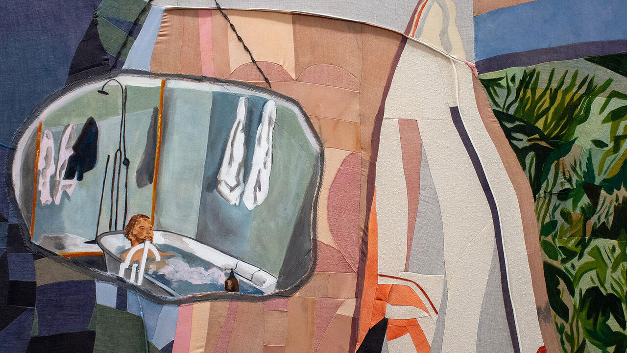
Thuring is a painter, although it might be more accurate to say she makes pictures in which paint plays a role. Her canvases carry fragments of precisely rendered image – cranes, potted plants, submariners – and the suggestion of material presence behind and in front of them. Recently, Thuring has painted these fragments onto textiles custom-woven with brick patterns or in works such as Loop Bridge and Bank Shot (both 2018) pre-painted with tartan. For Deep Screw (2018), she doubles up, pre-painting the tartan onto one of her own brick-pattern textiles. ‘It’s about how much you can put in by doing the least,’ she says. ‘I don’t want to show something that’s already well understood.’
Thuring’s aversion to self-contained, overly resolved painting is one shared by Phoebe Unwin and Clare Woods. While each artist’s style and technique is individual, they all exploit the human tendency to pattern recognition in paintings that hover at the edge of identifiable form.
For her exhibition ‘Pregnant Landscape’ at Amanda Wilkinson Gallery in London earlier this year, Unwin enlisted the associative qualities of colours – the hot orange-red of oxidized iron, the bleached-out yellow of long grass in high summer – and the synesthetic effect of their combination in evocations of subject. The liquid layers of lilac, rose and buttermilk that compose the head-like shape in Exposure (2018) suggest cool, crepuscular light and affection. The lichen green of a misty human form against the earthy smear of background in Silver (2018), by contrast, seems sickly and restive.

‘The paintings need to be made in a way that feels open enough to reveal something to the people looking at them, so that the colour is only just becoming recognizable,’ Unwin explained during my recent visit to her studio in north London. ‘I want it to be something viewers can construct, to act almost as building blocks in their minds as well.’
Three years ago, Unwin stepped away from colour. In a black and white series that includes Leaning Figure on Soft Ground (2015), fuzzy portions of the human body appear in the mid-distance through screens of flora. It’s an effect the artist achieved by laying plant stalks directly onto the canvas before applying Indian ink with an airbrush (a tool engaged, in part, because of its associations with photography). ‘I was starting to look at pictorial space differently,’ she explains. ‘It was not quite filmic, but the landscape and human forms within it grew from the ink and the mark. It would feel like a photograph and not be a photograph.’
Back in colour – and oil paint – this new sense of pictorial space has informed both the works in ‘Pregnant Landscape’ and a series of paintings destined for an exhibition next month at the Collezione Maramotti in Reggio Emilia. There, too, the paintings will suggest a connection to landscape: a single horizon line to link the canvases and a gallery flooded with natural light.
Unwin uses language suggestive of photography – the paintings are ‘very rooted in perception, in the sense of something being very full of feeling and full of charge, but not quite exposed’, she says. While she is attracted to subjects that carry the residual memory of generations of previous artworks, she does not draw directly on existing images: her work is rooted in a physical act of making and guided by an instinctive logic internal to each painting. She works up ideas in charcoal studies, but through these sketches she is ‘exploring and connecting forms’ rather than planning directly for her work in oils.
By contrast, Woods’s paintings on aluminium find their origins directly in photographic sources ranging from war reportage to Instagram snaps. They are ominous as heck: a painting inspired by a photograph she took of a distorted clown’s head at the Tivoli Gardens in Copenhagen is the stuff of nightmares; flowers teeter on the khaki edge of putrescence; dark patches of crumple on a bed sheet suggest foul emanations. If Woods painted a kitten, you would cover your ears rather than find out why. Two paintings of dead heads (English Murder and An Arctic Breakfast, both 2017), included in her recent exhibition at the Mead Gallery in Warwick, resulted from Woods being allowed to attend post mortems undertaken by a coroner friend. (‘They go in through your neck,’ she informs me, grimly.)
Quotidian fears can be found everywhere, in the image universe of social media as much as on the newspaper front pages. A few years ago, Woods had discussions with the Royal Marines about becoming a war artist but decided it wasn’t right for her: ‘I don’t need somebody else’s horror; I have my own,’ she says.
In flattening out her source material, placing images derived from intimate family snapshots (a kid goofing with underpants on his head in A Violet Hue, 2017; a teenage boy in Adidas track pants in Lover Boy, 2018) alongside historic photojournalism she aims ‘to demystify the fear and make it everyday’. Rather than ‘illustrating horror’, the paintings are allusive, suggestive: here, the work put in by the viewer – the effort of pattern recognition – is also a decision to stare into the shadows, to force yourself to find out whether what lurks in the darkness is something unspeakable or simply a dropped towel. Woods’s subject is the human capacity for imagination, the triggers that allow the mind to whip itself into a state of panic. ‘It’s all basic stuff,’ she says. ‘Life and death and love and hate.’
Woods paints thick, wet on wet, in massive strokes that pull colour along the firmness of her metal ground in barely broken streaks. Like Unwin, she is informed by the way space is created in a black and white image, untempered by the excitement of colour. Often, she sets herself a restricted palette: working the full spectrum afforded, individually, by viridian, purple madder or cadmium yellow. After years working in gloss, the mutability of oil excites her: the gradients of colour that can be achieved just by physically pushing into the paint and thinning it. It was while working on her show at the Hepworth Wakefield in 2011, she says, that she realized she’d ‘fallen out of love with household paint – there was no finesse, it was either on or off’.
At her large studio on an industrial estate outside Hereford, Woods works in series, with her panels resting horizontally on trestles. Using preparatory drawings, she meticulously masks up the primed aluminium before she paints: ‘They look abstracted and free, but they’re not. I’m a total control freak – there’s an order to it.’ Woods isn’t scared of big – a multi-panelled work, Udholdenhed (The Perseverance, 2014–15), commissioned by VIA University College in Aarhus, is 15 metres high – but she’s pushing herself to work smaller. She talks admiringly of a diminutive Méret Oppenheim painting of an unmade bed that we both saw recently: ‘You can pull people into something quite tiny, and push people away from something quite large.’
In the recent Tate St Ives exhibition ‘Virginia Woolf: An Exhibition Inspired by Her Writings’, Thuring’s Dutch Details (2013) looked huge, loose, almost pictorially exploded alongside early 20th-century works by Vanessa Bell and Winifred Nicholson. Whereas their paintings are set within a domestic interior, gazing longingly outward into the freedom of the landscape, Thuring’s studies of large, Dutch picture windows look intrusively inward from the street. Reflections on the glass of the surrounding road are visible alongside details of the window dressing – curtains, orchids, ferns – and hints of an interior. ‘The window is a thin strip of territory,’ says Thuring. ‘You can see beyond the surface – for all sorts of reasons, it’s like a portrait.’

Thuring grew up near the Holy Loch on the Firth of Clyde in Scotland: a site used, until the early 1990s, as a base for the US Navy Polaris and Poseidon nuclear submarines. ‘You would be in this amazing landscape and then see a submarine,’ she recalls. (This jarring combination of the high-tech, built environment and the wild lochs in turn echoes a question posed by Scottish artist and poet Ian Hamilton Finlay in a 1976 lithograph: ‘Are Aircraft Carriers Urban or Rural?’) In Thuring’s The Silent Service (2016), the shadowy form of a submarine – an object designed not to be seen – sits like a black void within an oval frame of plants and figures suggestive of a romantic Scottish landscape painting.
In Polaris and Bubblehead (both 2016), painted tartan patterns form the background to details of the goings on at Holy Loch: a crane loads nuclear fuel rods; a diver in a wetsuit comes through a hatch. ‘Tartan is a language. It tells you what’s what,’ says Thuring, who has also worked with patterns formed from pichação – a protest graffiti native to São Paulo. Both are readable combinations of symbols, the deeper significance of which is easily overlooked by those without the knowhow to interpret them: in the case of tartan, the ancient, original combinations of colour reflected the local plant life available to dye wool. The tartan pattern on which Polaris is painted (which itself is known as ‘Polaris Military’) was commissioned by the commander of the submarine squadron based at Holy Loch in 1964.
Built structure, the demarcation of territory and the relation between these imposed forms and the human body are themes Thuring has revisited across multiple series. She finds echoes of the body in the built environment – describing two shapes in recent paintings as ‘a nipple bulb’ and ‘a cocky thing’ – and echoes of the built environment in the constructed human form. In works such as Aggregate Man (2015) and Hamburger Helper (2016), the silhouettes of idealized bodies, male and female, are rendered in brick patterns. ‘The fact that the images are going towards something figurative, that they’re not entirely abstract, has always been important for my work,’ says Unwin. ‘That’s where the tension comes in.’ While otherwise distinct in their stylistic approaches, this underlying tension forms a common thread between these three painters. Each is pushing back against the current tendency for quickly consumed images. Their paintings do not succumb to digital speed. Works by Thuring, Unwin and Woods might tease with their suggestion of recognizable forms and evoke strong associations in their use of colour and pattern – but they don’t yield easily.
Main image: Caragh Thuring, Deep Screw, 2018, oil, line marker, bitumen and graphite powder on woven cotton and linen, 1.7 × 1.4m. Courtesy: the artist, Thomas Dane Gallery, London, and Anthony Meier Fine Arts, San Francisco.